2024
Role
Product Designer
Services
Web Design and Development
User Experience Design
User Interface Design
Collaborators
Leo Lee
Dawson Zhang
Alibaba.com Star Ratings
In the Alibaba.com Star Rating System redesign project, I served as the lead designer, tasked with enhancing the usability and user engagement of the platform’s evaluation feature. Through this project, I realized that product requirement documents (PRDs) often address business needs rather than deeper user needs. While the PRD initially focused only on displaying user performance dashboards and benefits, I advocated for integrating direct calls-to-action that guide suppliers on how to improve based on their ratings. This contribution not only met but exceeded project requirements by aligning with actual user needs, teaching me the importance of user-centered design in fulfilling and anticipating deeper user requirements for impactful product development.

Problem
The business context for this project centers on the recent expansion of Alibaba.com’s Star Rating system from 7 to 12 indicators between 2023 and 2024, which increased its complexity. This expansion was meant to provide a more thorough evaluation of suppliers but also made the system harder to understand and use, raising the cognitive load for users and perceived effort for suppliers. Recognizing these issues, the product team aims to simplify and clarify the rating system to improve user comprehension and engagement, helping suppliers better utilize the platform’s evaluation metrics.

User Reserch & Pain Points
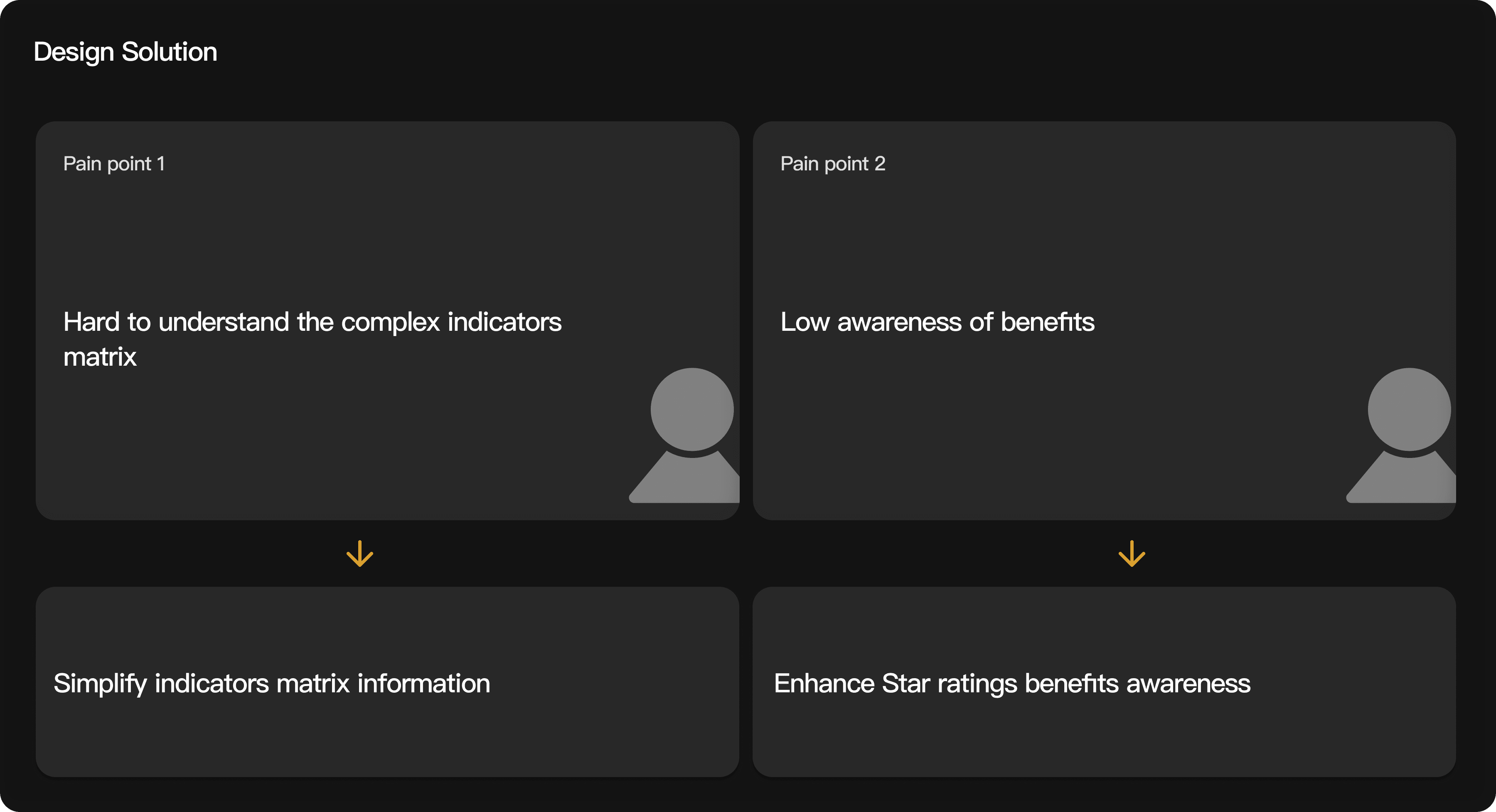
In this project, I conducted user interviews with 8 suppliers from Vietnam, Turkey, and Malaysia to understand their pain points regarding the Star Rating system on Alibaba.com. The feedback revealed two main issues.
Firstly, users found the rating system difficult to understand, indicating that the criteria or benefits were not clearly communicated or easily interpretable.
Secondly, users reported a low perceived sense of benefit, suggesting that they did not fully appreciate or recognize the advantages of achieving a higher rating.
These insights highlighted a gap between the platform’s intended value proposition of the Star Rating and the users’ perception of its utility, guiding our redesign to make the system more transparent and beneficial for users.

Current Interface Problem
The current interface of the Star Rating system on Alibaba.com presents several usability challenges.
First, there is a low screen efficiency, with extensive information displayed in a way that requires excessive scrolling and navigation, making it difficult for users to grasp the key points quickly.
Additionally, the star rating indicators themselves are lengthy and complex, with multiple detailed components (4 + 5 + 3), which adds to the cognitive load.
The interface presents tasks and indicators on the same screen. This layout contributes to confusion by packing dense information without clear visual separation, significantly increasing the mental effort required for users to understand and act upon the rating criteria. This design flaw overwhelms users and creates a substantial barrier, hindering their ability to effectively utilize the Star Rating system. Such an overwhelming interface can deter user engagement and satisfaction, emphasizing the need for a UX overhaul to streamline information presentation and improve usability.

Simplifying indicators matrix
Enhance Star ratings benefits awareness
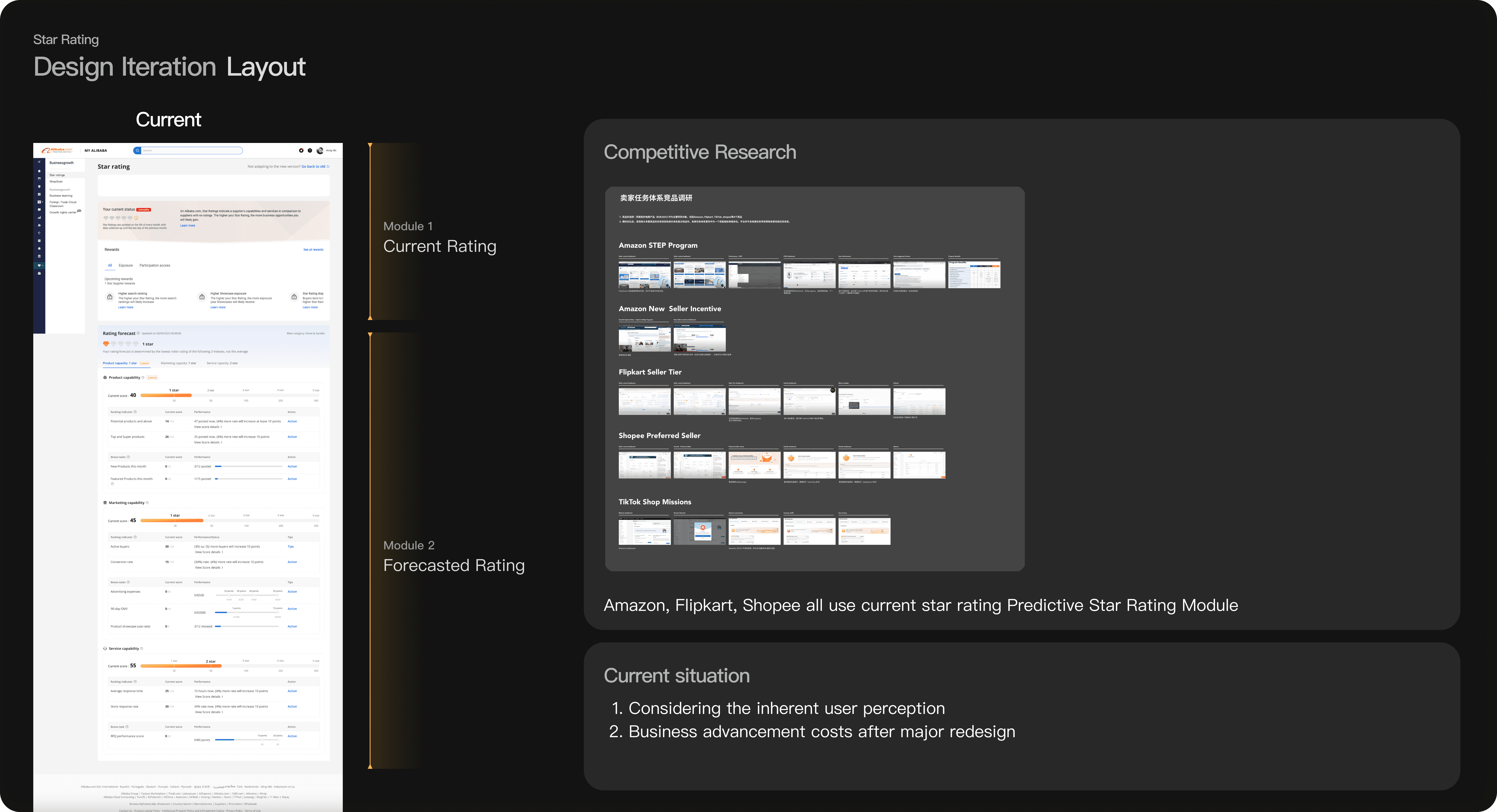

Design Change
Layout
In this design update, I chose to keep the existing layout for the “Current Rating” and “Forecasted Rating” sections. Research on popular platforms like Amazon and Flipkart showed that users prefer a simple, consistent layout for star ratings.
By keeping the structure the same, we make it easier for users to understand and navigate without needing to learn a new format. This approach also helps avoid the extra costs and risks that come with a major redesign, allowing us to focus on improving the rating features without disrupting the user experience.

Design change
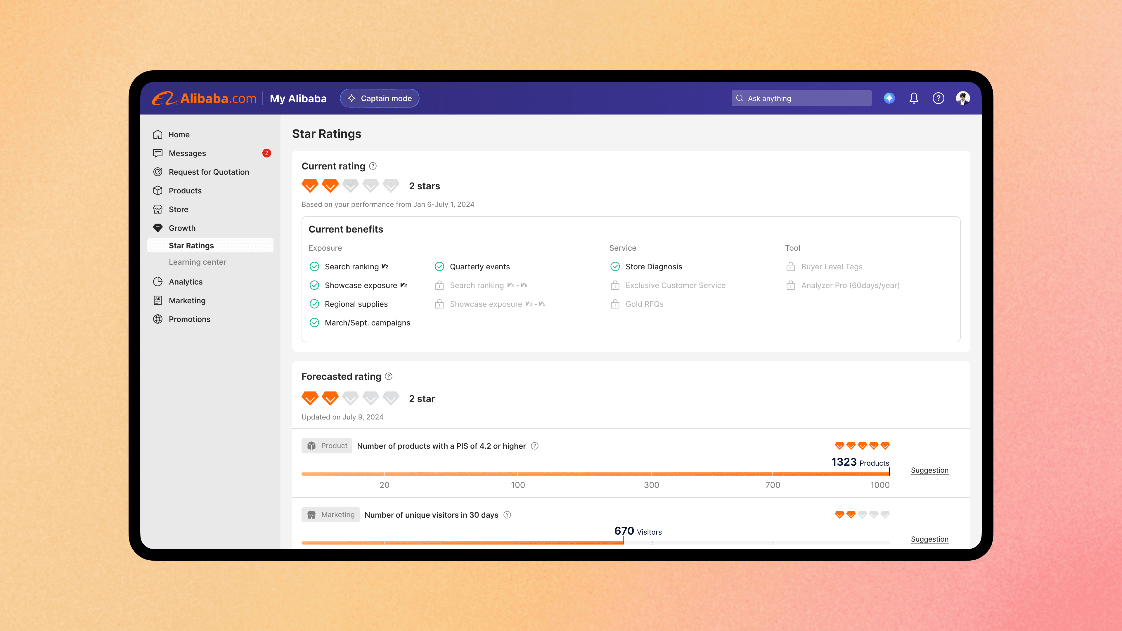
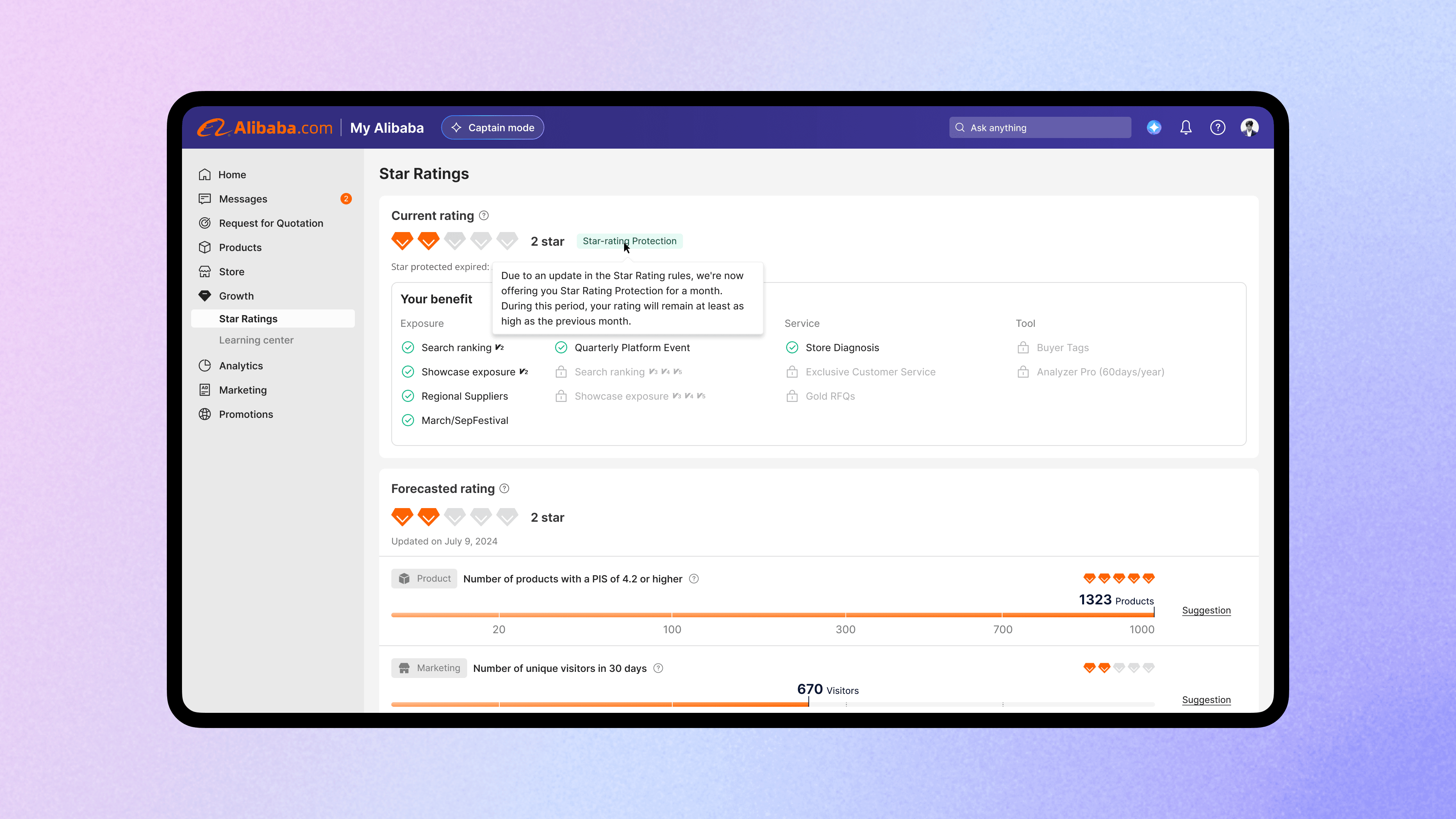
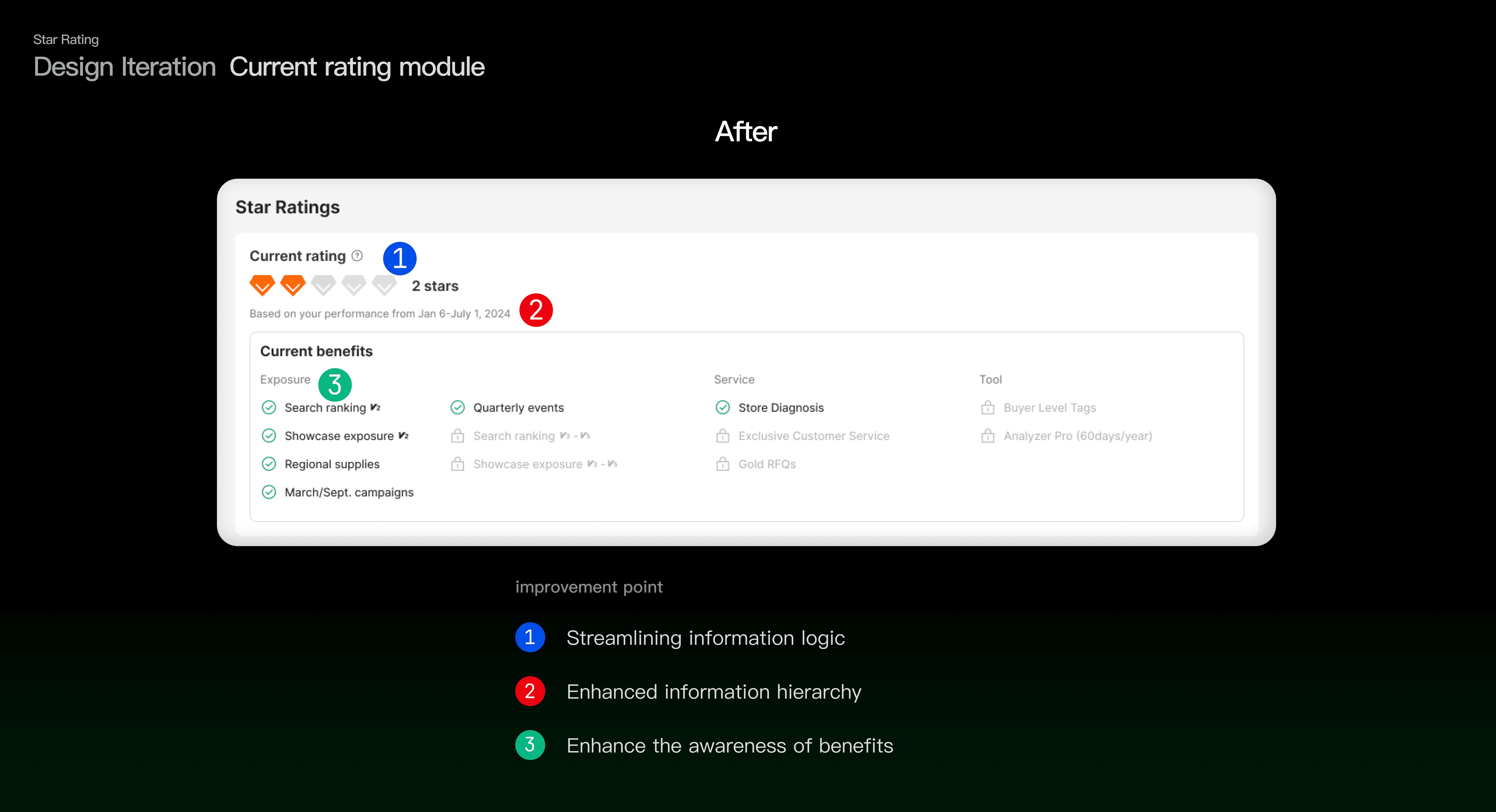
Current rating module
For the “Current Rating” module, I focused on simplifying and organizing the information for better usability. The previous design had issues with redundant information, a lack of clear visual hierarchy, and complex interaction, which made it hard for users to understand their status and benefits.
In the updated design, I addressed these issues by
streamlining information to reduce redundancy
creating a clearer hierarchy to improve readability
enhancing the visibility of benefits to increase user awareness
These changes make it easier for users to quickly understand their rating, access relevant features, and recognize the advantages of their current status.


Design change
Forecasted rating module
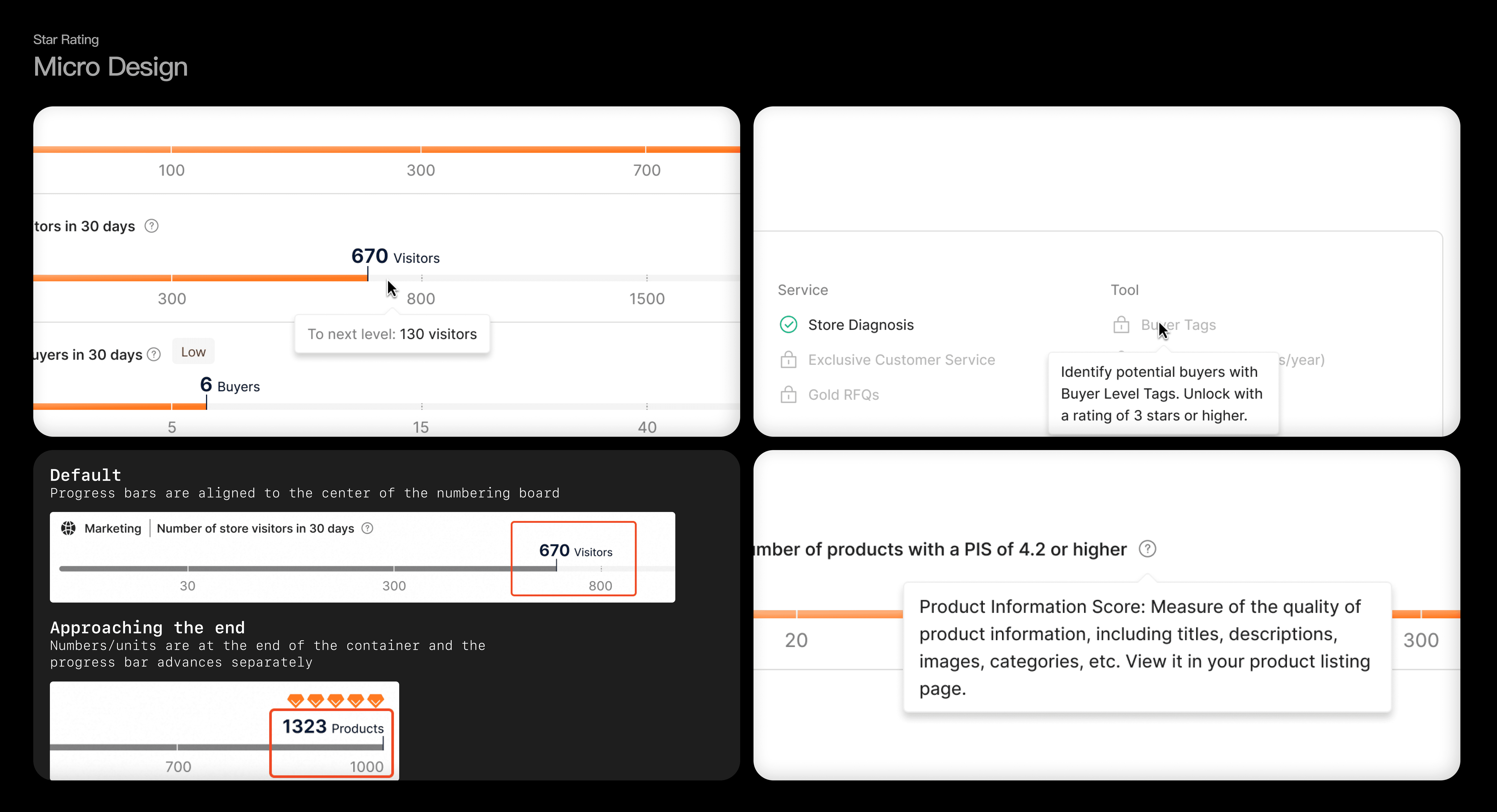
In this design iteration for the “Forecasted Rating” module, I aimed to simplify and clarify the layout to improve user comprehension. The previous design had deeply nested information, making it hard for users to follow the logic and find relevant details.
The updated design reduces this nesting to make information more accessible (1), establishes clearer visual continuity to help users understand the relationships between elements (2), and emphasizes key indicators by showing numerical values clearly, along with guidance on actions needed to improve their ratings (3). These changes create a more intuitive and user-friendly experience, helping users quickly understand and act on their forecasted ratings.
Next step iteration
1. Feedback-Driven Updates: I plan to collect and analyze user feedback after the new design is launched. This feedback will inform future improvements, ensuring the module evolves based on actual user experiences and needs.
2. Enhanced Benefit Model: I aim to increase touchpoints that encourage users to improve their rating by adding more prompts and incentives. This approach will further clarify the value of achieving a higher rating and drive user motivation to engage with the system.
3. Streamlined Logic and Indicators: I’ll continue simplifying the structure of the rating indicators, potentially replacing complex metrics with more intuitive alternatives. This will help maintain a clear and accessible experience, minimizing cognitive load and making it easier for users to interpret their rating information.